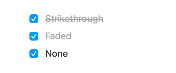
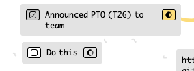
Different styles for check boxes would be amazing. I never check them and add a Done tag instead. I don’t have this problem in Notion where I constantly check things off, maybe cause of the light grey or something. It’s hard to read them just crossed out in the black text color. I saw this on that other note taking app called Craft, they do three options for checks
My summary:
@ethan to clarify, you want a “done” card (a to-do card that is checked) to be more readable, and your proposal is giving the user options on how checked to-do should be rendered (that is, strikethrough (current), faded, or none)?
I’m using Kinopio more as a planner (again) and that makes consider this request with more interest. I think when I’m reviewing everything I’ve done for the day, the strikethrough makes it a little tedious to read (although it is not terrible). I tried out a few other examples just to see:
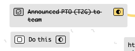
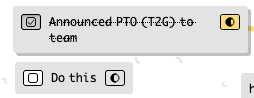
Another option, that I’m just familiar with from Notion, is faded with strikethrough. So the current version, just faded. This may not work as well on Kinopio with the font perhaps…
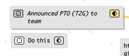
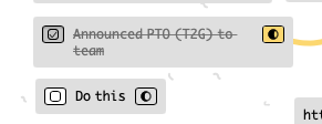
Here’s faded with strikethrough. To me this is counter to the main goal, which is to make checked todos be easily distinguishable from open todos, but also be readable
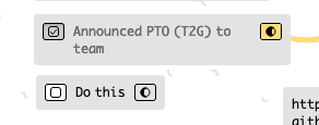
I can also change just the strike through line color if it helps. For me once a thing is ‘done’ I’m not really trying to read it frequently or quick reference it so I like that done feels done