Card design, more focus on content less noise? :)

My point is about less interface noise more focus on cards.
Screen Recording 2021-10-22 at 02.40.53

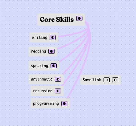
Made a rough fix for myself with custom css
Screen Recording 2021-10-22 at 02.42.44

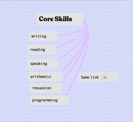
if you need one for yourself:

.connector {
opacity: 5%;}

.inline-button{
box-sizing: border-box;
border:1px solid rgba(0, 0, 0, 0.2) }

.connector-icon {
opacity: 0;}

.card:hover .connector {
opacity: 100;
border:1px;}

.card:hover .inline-button{
border:1px solid black;}

.card:hover .connector-icon {
opacity: 100}
2 Likes

that’s neat, what’s your method for loading custom CSS?

btw, a big reason why the buttons and links are always visible is because in the case of mobile/tablet, you can’t rely on hover :slight_smile:

1 Like

I use this Custom CSS extension

Yeah I get it with touch interfaces, but It’s more global concern of visual side, cause on the first glance see all the buttons and then the actual cards content

1 Like