One of these is a colored card, and the other is a selected card. Prior to colored cards, it was obvious when I (or another collaborator) had selected cards. Now it is really hard to tell (they are visually the same).
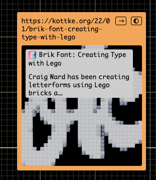
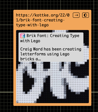
One of these is a colored card, and the other is a selected card. Prior to colored cards, it was obvious when I (or another collaborator) had selected cards. Now it is really hard to tell (they are visually the same).


Selected could maybe have a little glow around the card, like the animation you get when first selecting something.
Exactly :). Like shadow or outline in CSS.
maybe this…
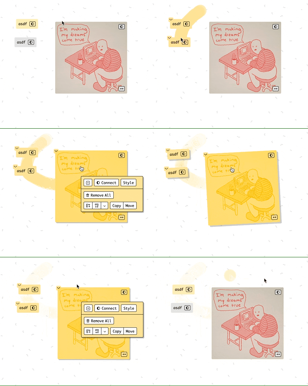
I like that a lot.
Looks nice! How does it coexist with the “stack indicator”? (I mean little black boxes with white numbers).
worst case scenario it overlaps like this, but i think irl seeing at least one indicator is enough to indicate that the cards are selected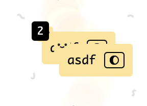
Sure.
Brainstorming:
 " when selected.
shipped, I don’t think you’ll find it a problem irl so i’ll keep it simple and stupid for now
Works well!
The faces just look a little bit sad :(… ![]()
huh it’s the same face pic, it’s a smile :), but maybe at too small size it looks like a neutral 
I know… but it looks somehow sad :(.
But it is no big issue. Maybe the cards don’t want to be selected ;).