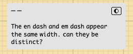
super minor
The times symbol in OsakaMono-Kinopio is rather large:
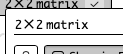
It isn’t consistent with the other operators. ¯\_(ツ)_/¯
super minor
The times symbol in OsakaMono-Kinopio is rather large:
It isn’t consistent with the other operators. ¯\_(ツ)_/¯
@pirijan In case you’re making any modifications to OsakaMono-Kinopio, bumping this if it’s an easy fix 
I need to add a couple extra characters , namely a couple accent chars commonly used in french, spanish. When I do that I’ll add it to the list, it’s a whole context switch to remember how fonts work 
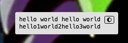
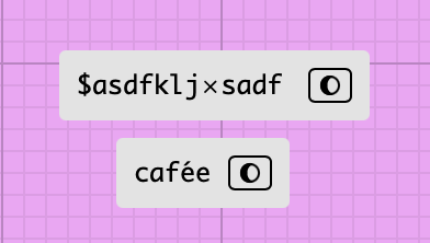
now that you have me scrutinizing the font, I noticed that spaces are not consistent:
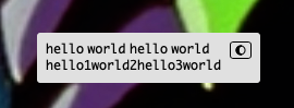
Those lines should be the same length, right? unless it’s intentional? Here is the system monospace font:
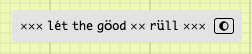
the font I’m using is derived from a japanese font (osaka-mono) so I’m guessing that’s the reason. I chose the font for it’s creative feel/malleability more than strict monospace-ness so I’m okay with that
added this to the roadmap
appending this request from mathias 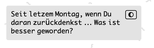
I’ve semi fixed this by adding a couple new glyphs
But there’s still a couple more latin extended chars that are missing still. I have to add/draw them manually.
Notes to self on how to add the rest of the glpyhs:

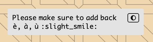
Please make sure to add back è, à, ù :)(https://discord.com/channels/857305113936134204/857724063903252530/882115376048132117 and https://discord.com/channels/857305113936134204/857724063903252530/882117423522779188)
added. also fixed the character widths of most math symbols to make them more consistent.
fontlab is so good (relative to the crappy free options, it’s the only thing that works competently) – but it costs a whopping 500$, so if there are any more missing glyphs/characters (esp latin-based ones) that look weird and issues let me know asap(!) so I can fix them during the app trial period 
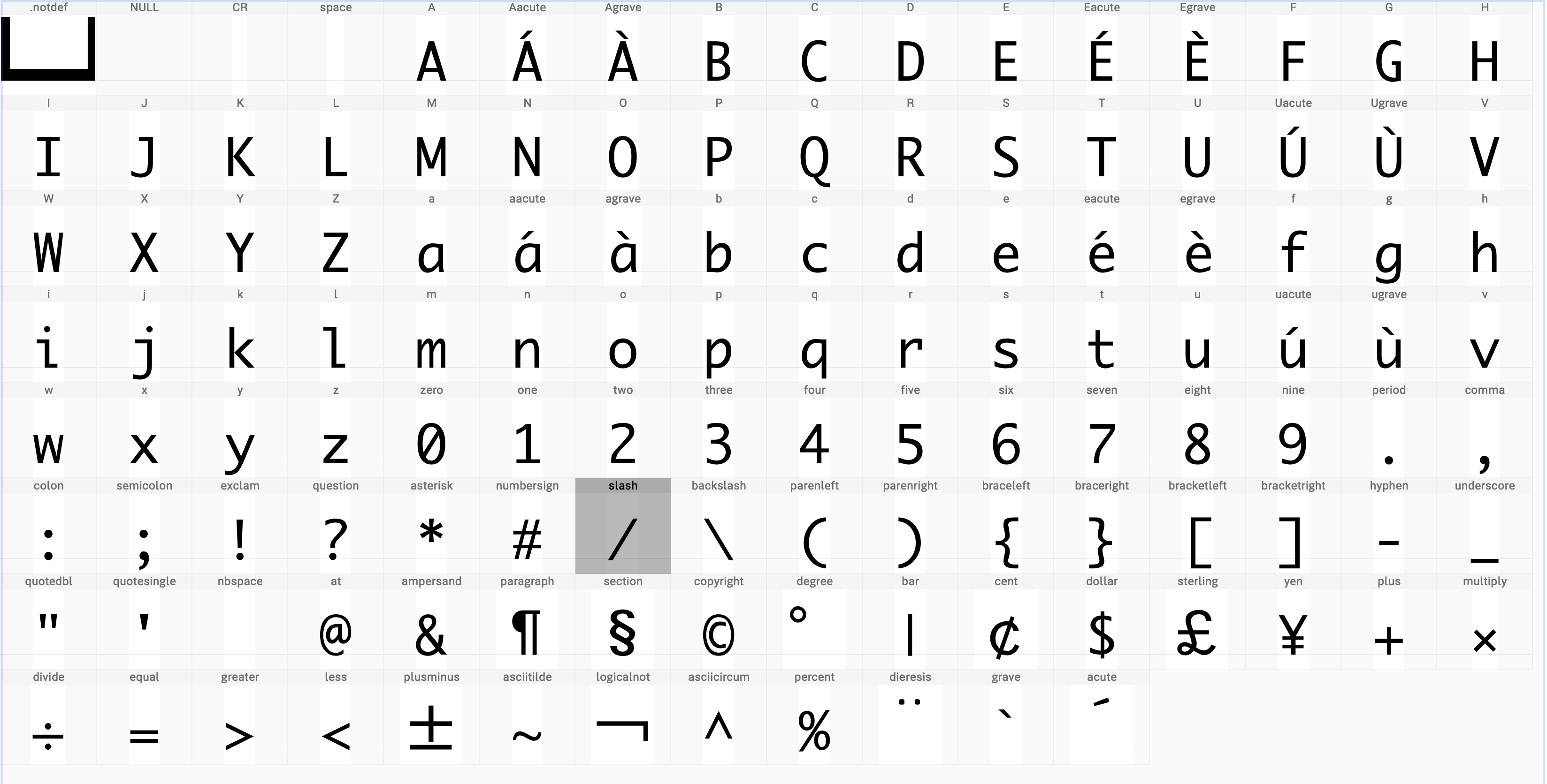
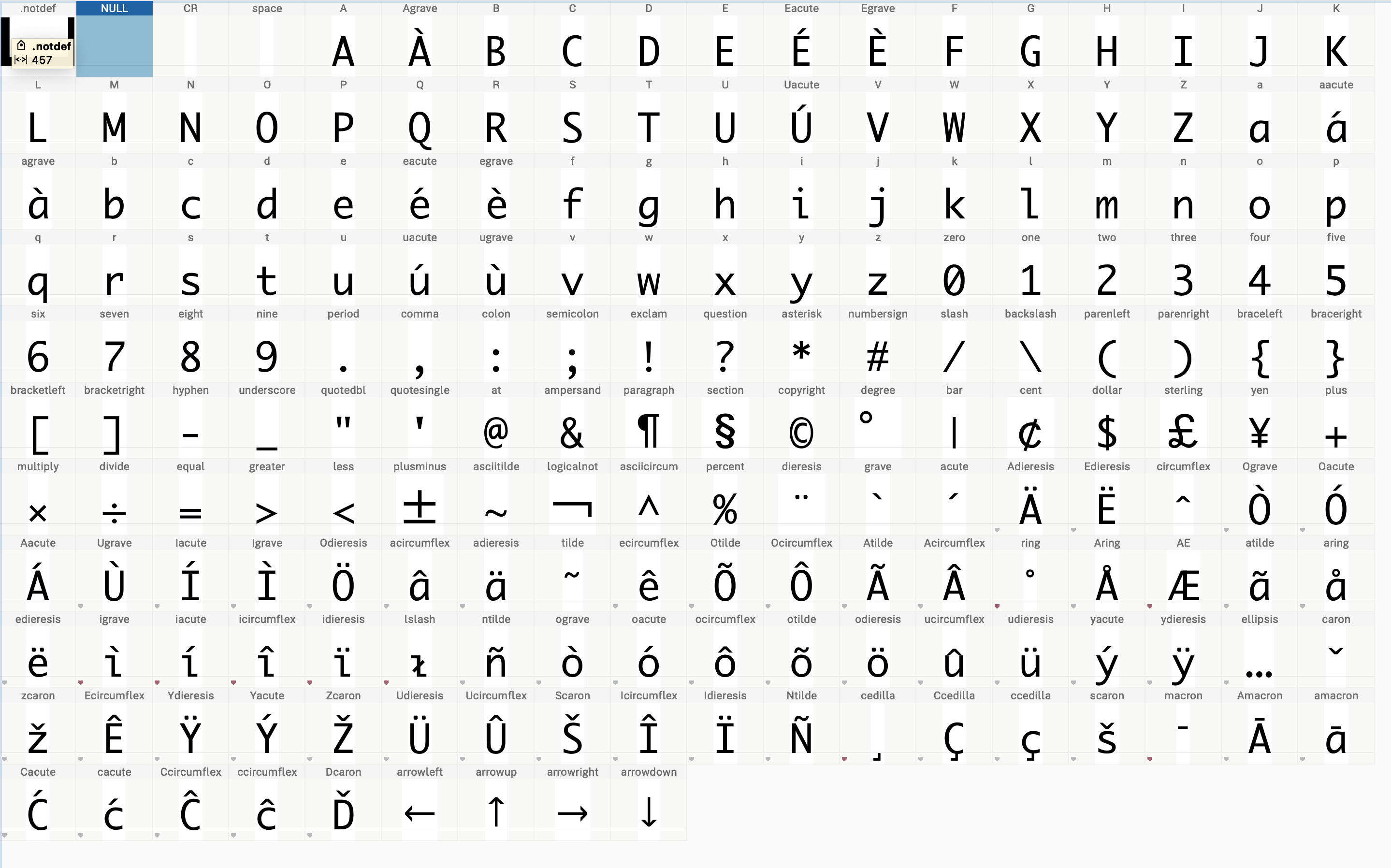
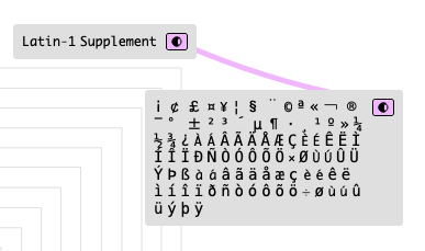
the other big change that fontlab let me make is to explicitly define what fonts will fallback to monospace. This lets me keep the font size super small (10kb) and not have to draw everything. Here’s the complete set so far
@juliendesrosiers ping: if you find any more font issues please let me know and I can fix them asap for you
I made a test page. Def not saying to clean all these up, but thought it’d be good to see how they render. In my opinion, the glyphs that are out of place are letters that have diacritics or other markings (a bit out of my element, don’t know if the terms are correct). But basically, maybe consider cleaning up some these:
For example, this is glaring:
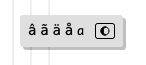
and etc for the other vowels.
Here’s a space I started putting some samples: https://kinopio.club/unicode-test-space-rJZy2RZ02fn5COswjS9eF
Which I pasted from https://www.ltg.ed.ac.uk/~richard/unicode-sample.html
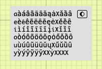
aàáâãäāăąȧXǎȁȃ
eèéêẽëēĕęėXěȅȇ
iìíîĩïīĭįiXǐȉȋ
oòóôõöōŏǫȯőǒȍȏ
uùúûũüūŭųXűǔȕȗ
yỳýŷỹÿȳXXẏXXXX
super helpful thanks!
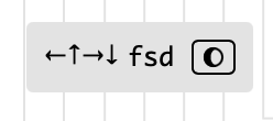
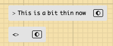
Just for your consideration, it’d be nice if these arrows were more defined
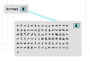
Probably more work than it’s worth, but thought I’d bring it up since you’re asking And maybe not all of them, but the major ones (left right up down, NE SE, etc)
A few more tweaks
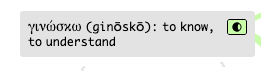
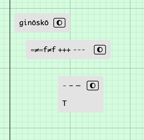
Could you tweak the o in ginōskō? I have that in a few of my spaces where I’m writing the transliteration of Greek.
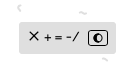
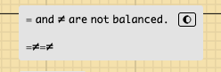
Also, some of the math symbols are not balanced. The greater-than is a regression, I believe:
chars updated