This is fascinating. I would love to get a peek of your memory palace if there’s a portion that is suitable (or you can scrub) ![]() I’m curious how you scope your spaces, organize within and without. Do you use boxes, tags, other ways to group and annotate data? Etc.
I’m curious how you scope your spaces, organize within and without. Do you use boxes, tags, other ways to group and annotate data? Etc.
3 Likes
Let me see if I can find something shareable.
But all these comments gave me an idea to create a shortcut kinopio.club/new and see if I can use that as my inbox / scratch book.
I think what I really needed is a blank space to start thinking/writing/processing info. Obsidian made it feel easy and “cheap” to do, as it’s super easy to just create pages and then get rid of them. If I start thinking about Kinopio spaces as “pages” at least for these purposes, it might work similarly.
My current plan is to have Kinopio open a new space each time I have a new thing to write down, and then see if the content is worth saving in an existing space, and if not either hide (archive) or delete the space once I’m done. Hopefully nothing will break, as I’ll have a ton of deleted spaces.
1 Like
Your inbox might be a good place to have a shortcut to (rather than /new) in order to avoid having a bunch of spaces that might not lead to anything concrete.
Then when you are ready, you can highlight a group of cards in the inbox → Move to new space.
Plus Kinopio has the extension for adding to your inbox and you can use the +Inbox button in Kinopio to add to the inbox when in another space.
2 Likes
Yeah. I’m aware of the Inbox feature but I don’t like having cards in a space already when I start writing something new.
3 Likes
FWIW, I’m finding it much easier to write out initial thoughts in something like Obsidian (especially on mobile) because:
- don’t have to worry about zoom; it’s always the same and the text size doesn’t change between editing and viewing
- similarly, editing mode doesn’t add any additional UI elements that may distract from what you are writing (this can be particularly jarring if the color scheme of the space is different from the default scheme for the UI elements)
- don’t have to worry about screen position or panning to the right spot, it’s just there on the first/next line
- don’t have to worry about other things on the screen. Very easy to start with a blank page and just start writing without having to worry about anything else
All that said, once this “rough draft” is done. Processing it and thinking it through is much much easier in Kinopio as it provides tactile feel to text blocks, you can move things around incredibly easily and distinguish or link them visually
1 Like
I have very similar feels to these points. I’ve talked about how in a document it’s super easy to get in and out and it’s obvious where content will go. You don’t have to worry about positioning. (How to deal with groups of sequential cards - #15 by bentsai)
That was in the context of lists, which I’ve been experimenting with in my extension.
But also more broadly there’s something to be said for a quicker entry. Inbox doesn’t quite do it for me because cards go into the ether and I don’t have the context after I input a card. Also in the Inbox space, yea they are neat in a column but they still feel untethered.
I’ve been wondering what would improve this. For me something like a “table” view with metadata so you can see when cards were created and it is easy to sort. I’m not proposing a UI necessarily, just trying to put my finger on what would make this a better experience. A more useful quick entry mechanism which lets you later triage and organize.
1 Like
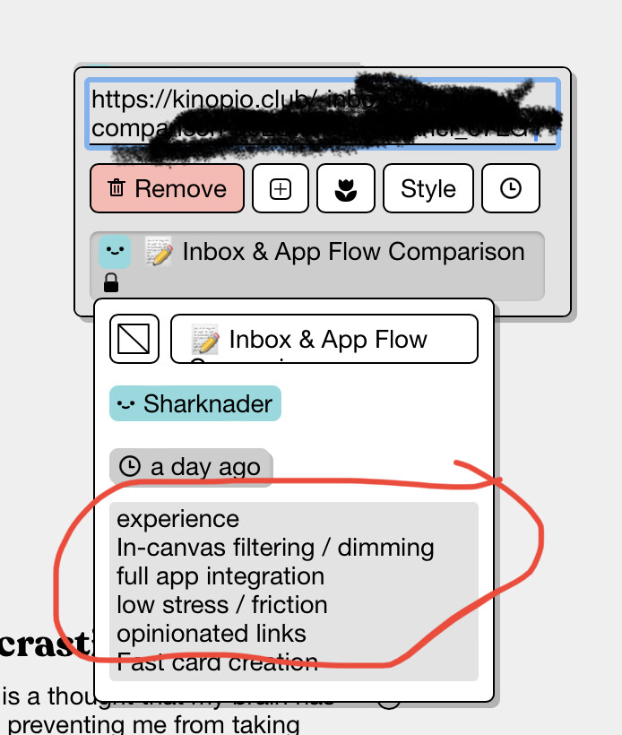
Or what if cards in the Inbox are automatically put into boxes by day (all cards entered on this day), and those boxes auto-tidy?![]()
Yeah, it’s kind of why I was trying to just create new pages as an Inbox substitute, as new pages show up right under favorites in order of last modified. And these pages have cool random names, so it’s easy to distinguish from permanent notes. I also use emojis in the names of permanent spaces like ![]() for projects and
for projects and ![]() for explanatory spaces, so spaces without these stand out. Like a poor man’s metadata.
for explanatory spaces, so spaces without these stand out. Like a poor man’s metadata.
I don’t know what a good solution would be. But it’s definitely one of my biggest pain points right now.
1 Like
That could help, but with the character limit, Inbox cannot really accept all things. So it can’t really be a true inbox (only for certain things).
1 Like
What kind of stuff do you want to capture but exceeds the character limit?
Long text excepts and other people’s analysis.
Frankly, I don’t know if anyone has this figured out 100%. Roam-likes are not perfect as you have to tag the blocks to come back to them, and stuff doesn’t always translate into an outline well. Note-based apps like Obsidian /Evernote have more flexibility with taking in a variety of formats but then they are not great with manipulating content. Heptabse is sort of straddling in the middle (but more note-based and not block based), but I think the jury is still out there
1 Like
This doesn’t solve all use cases but what if you could click the footer inbox button and , in addition to letting you quick entry, it’d display a list of recently added cards that you could click or drag to move to the current space?

3 Likes
That would be pretty awesome
1 Like
Maybe a dumb idea, but what if there was a way to expose and edit a text only version of a space? Something like what shows up in the space references preview?
3 Likes
I like this idea. Basically helping get cards from the inbox into other places without having to visit the inbox.
2 Likes
This is another cool idea. I kind of wish the circled area could have some design to help differentiate between cards, but being able to edit from there would be killer.
2 Likes
it’s a cool idea, but building a totally diff text editing ui view would be a very big task
2 Likes
for scope reasons , it’ll be click a card to add it to the center of your viewport (no dragging it in)
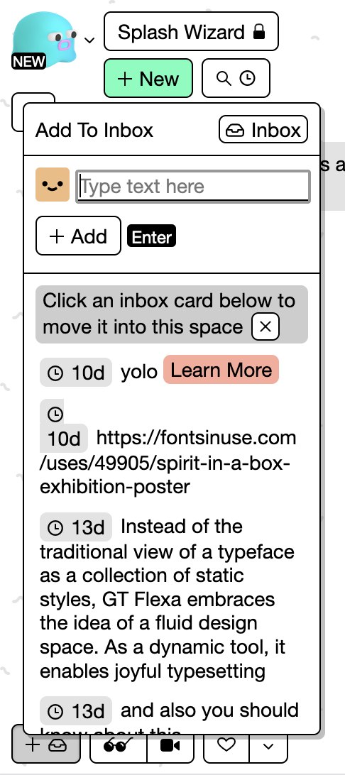
I was thinking of either:
- show a dismissable tip that “clicking on a card in the list will add it to this space” (pictured above)
- or don’t show a tip and instead show a ‘move here’ kind of button over each individual card. Clicking the card in the non-button region would take you to that card in the inbox).
i’m leaning towards #2, because that’d be more consistent with the behaviour of list items everywhere else in the app
3 Likes
Why is the Inbox special here? What if you could do this with any arbitrary space? I’ve sometimes wished I could split my window between two spaces and drag between them. This feature would let me at least see the context of the destination space.
I know you’re trying to limit scope but perhaps for consideration in the future.
Ben
1 Like
Why is the Inbox special here? What if you could do this with any arbitrary space?
Just like in the browser/raycast extension, the inbox being special here eliminates the friction-of/need-for manually selecting a source space – it’s a deliberately more opinionated flow
1 Like