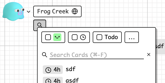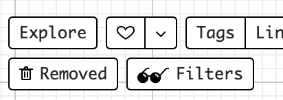
So currently, there’s a Filters button at the bottom which lets you toggle and highlight information. It’s pretty powerful, but I don’t think it’s used or discovered because it’s kind of in an out-of-place flow.
Just like things like yelp/seamless, I think filters would be used more if they were integrated into search – both answer the question “show me what I’m looking for”
The downside is that the less used stuff like filtering for a specific tag, frame, or connection will take an additional click to access, but I think it’s a net win
1 Like
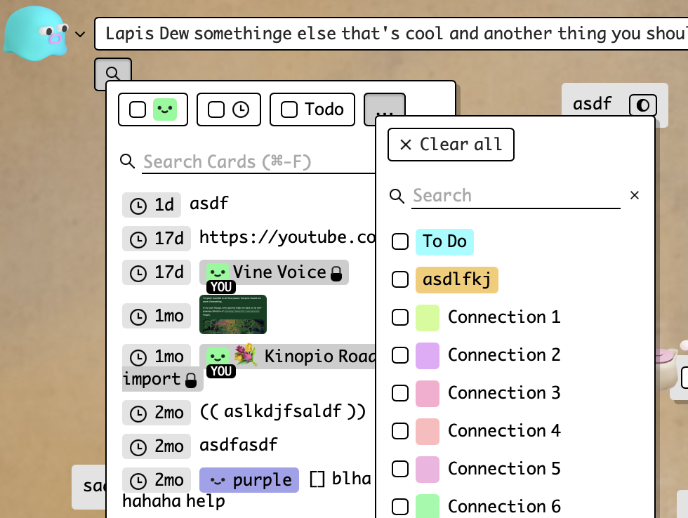
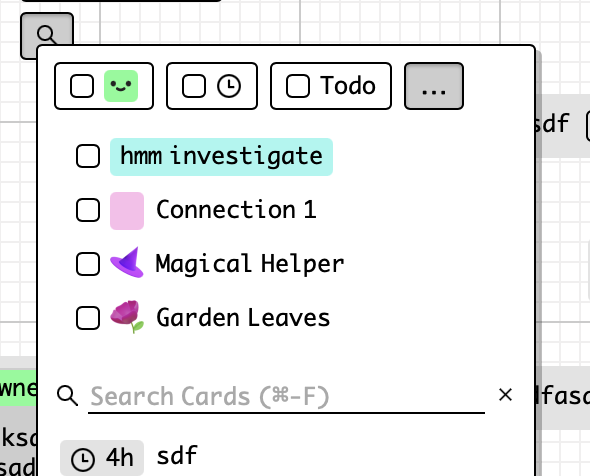
updated to use another dialog window (the positioning is much easier, less disruptive to card search results too)
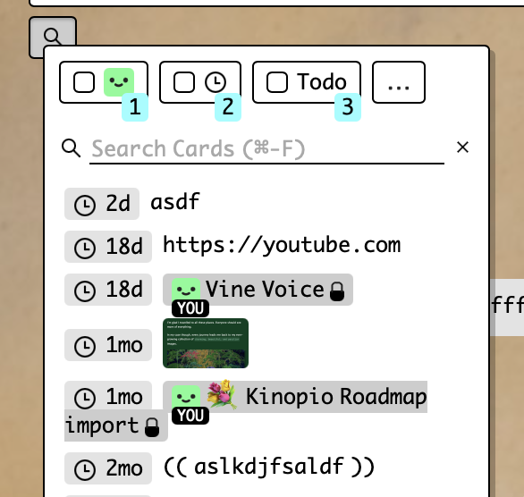
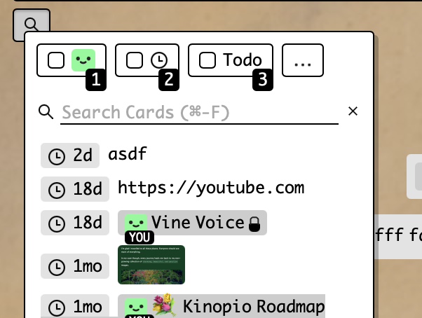
I want to expore the keyboard shortcut keys for each filter (1,2,3). I don’t currently have a convention to do this, here are a couple visual treatments to do that
^ I usually use this blue button to represent ‘info’ , but it doesn’t work in this case because (high contrast takes too much attention, and it’ll clash with the total filters count badge (not pictured))
^ I use this grey for secondary info (like the relative dates in the search results), but maybe this is tertiary info
I like the last two because they aren’t confusable with other ui elements. The grey text is subdued and matches the placeholder but it’s a new color I have to introduce for body text. Do these read as - or hint as - ‘keyboard shortcut’?
there’s also this black/white which seems way too high contrast/primary, but maybe reads more clearly as ‘keyboard shortcut’?
Is the idea to always have these shortcut indicators visible? Keyboard shortcuts are pretty power-user-y so they are tucked away in a separate hep dialog or on hover in a tooltip. I’m not against always displaying them, though. Another option is to make those helps appear when you hit ? key.
I like the treatment where it matches the light grey of the placeholder text, since that currently has a reference to the ⌘-F, so it ties it together somewhat.
A thought is to introduce another treatment that makes it look like a keycap, similar to discourse?
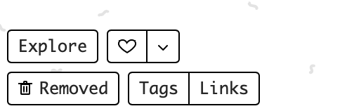
One last separate thought: the search button (with magnifying glass icon) feels like it should be bigger to correspond to the functionality in there, and maybe just to balance it with the space button? For example, the Removed button has icon and label, and i feel like that is much less used. So maybe it deserves an icon and label?
Ben
1 Like
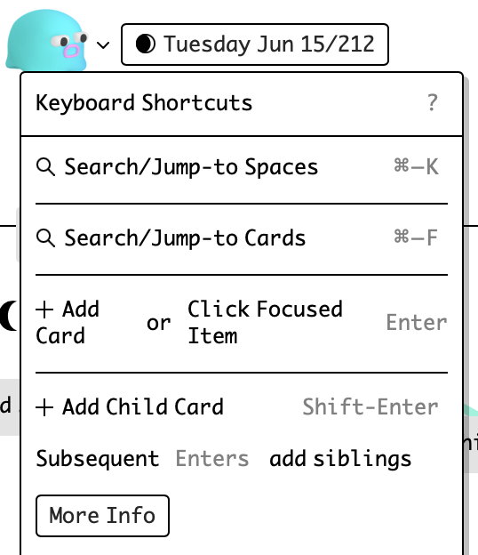
ya I have them tucked away, I’ve updated the styling of keyboard shortcuts dialog to match
but I also want to expose them more inline for people kinda on the fence of being power users, like macOS does
re keycap styling, in the context of being in another dialog with buttons (eg the find dialog), it’s hard to differentiate the keycaps from buttons when both have solid borders of any kind
I could add a ‘find’ or ‘search’ label to the button but I think the magnifying glass is a pretty universally understood icon. Unlike the ‘removed’ button, the ‘find’ being in a much more prominent position (top-left) makes it much more likely to be noticed
1 Like
whoops, I totally forgot this in the moment, and how pressing ? brings it up.
Okay, that’s fair. Adding a label there would also distract from the space name.
1 Like
a lot of search power in a small space
without the filters button the footer is relatively nice and airy
top row = discovery/social stuff
bottom row = more advanced space/organization stuff
1 Like
ok shipped 
code-wise it ‘should’ be a pretty safe release, so try it out over the weekends let me know how it feels and works. I’ll promote/tweet the release on monday prolly
1 Like