why is a a sidebar more space efficient than a button in the footer?
It’s not - I haven’t done a great job at getting my thoughts across here… I don’t think footer vs side is really the right way to frame it… There are a few aspects that led me in this direction… for me the left side of the screen is more important than the real estate on the right side. Especially on a smaller screen. I tend to focus on the left side more as I work, but also, you can’t leave these dialog menus pinned open because anything on the far left hand side is permantly blocked with no way to access them through scrolling, only unpinning.
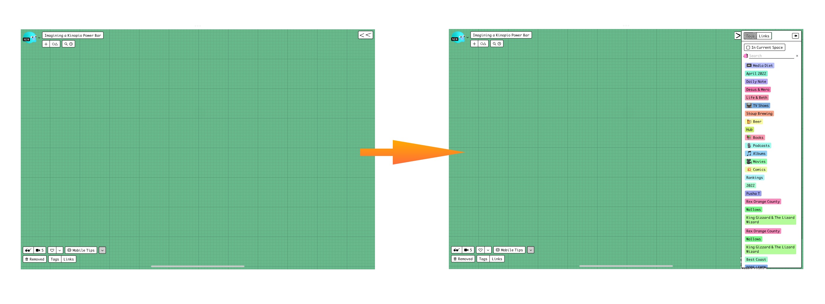
Shown here: there is no way to edit or see these cards on the left hand side while the dialogs are pinned open. However, Kinopio always has margins built in on the right as cards get added, so this wouldn’t be a problem on the right hand side. In fact, through some testing just now, anytime I add a card to the far right of a space, Kinopio adds enough space for 1.5 sidebars (guesstimating here), so that there is always room to ensure nothing is permanently blocked without having to use a bunch of clicks to unpin, click away so it hides itself, get to the card, reopen, and re-pin. This allows you to have the dialog open and ensure you always have access to all cards on a space with a simple scroll, never having to close the dialog.
The first thought after that is maybe why not move these buttons to the bottom right, but I don’t think that’s right either. The bottom right essentially signifies the open space, directing the user to move from top left to bottom right. Having permanent buttons there (whether open or not) would just feel weird, imo, hence the tab idea in the top right to get to these, and leave them open (never worrying about obstructing cards or other buttons).
what happens to the existing share/user buttons in the top left?
Great point, I admit my mockup was done very poorly. I’d have the button to open right below the notification number so the top of the sidebar would stay at that level, never obstructing the user, share, and notification button.
Which that brings up another issue with the current dialog implementation. I can’t keep these pinned open, because they obstruct other things in the bottom left.
So while this…
- view all three ^ together
… is important to me, not only does the current dialog implementation not allow me to do that, it also prevents me from getting to Explore, Live, and Favorites.
I think a big aspect is these dialogs, when pinned open, feel disruptive from accessing a plethora of other things. Essentially, you can only do one or the other.
There really is no way to live with these pinned open in their implementation today. I will eventually have to unpin to view/edit the cards on the left (which, in my spaces, are of high importance), or Explore, or Live, or Favorites. The right hand side solves all of these (although I’m probably forgetting/missing something)
And when you throw all of this together, the sidebar tab gives you one click to open, one click to close (if it’s possible to have these share real estate and remember the state of each…). Pinning requires two clicks to open, two clicks to close. In the grand scheme of things its minimal, but for something I truly want to be ever-present, but have to continually close to be able to access other things, it adds up and starts to feel tedious.
These mockups probably do a better job showing how it can live in harmony with the current top right menu…
If we look from the point of view of a pretty fresh space, the Tags dialog pinned open obstructs cards on the left side, and there is open pasture on the right hand side. You might think that’s fine, you are done with the left hand side and should be working towards the right anyways. And while that’s true, I still want visibility to those cards, and there is sooo much open space to the right that I could simply scroll a fraction to allow myself to continue working. Essentially, it’s not so much the size or type of the dialog that matters, but the location (although I think the tabbed sidebar idea makes it possible in less clicks).