Based on the feedback that the new user experience can be jarring and intimidating, on discord (https://discord.gg/h2sR45Nby8) we discussed a couple options for a static marketing website to meet more people where they are
goals
- be more normal , in the sense of matching people’s expectations to know
what this is and what it's used for upfront
- introduce them to some examples/templates
- still capture the spirit of the rest of the app, marketing page should feel to the app
- low size, low maintainance
some ideas
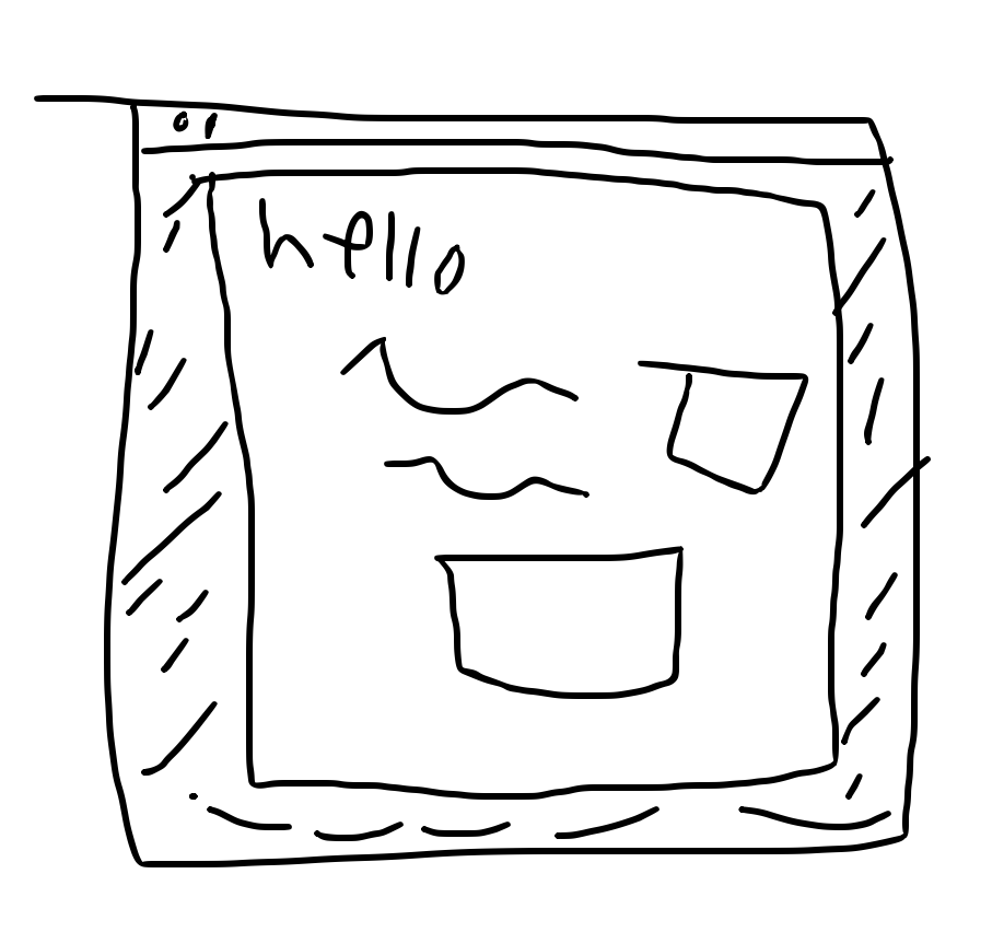
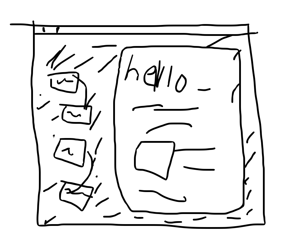
overlay with iframe on top of the welcome space, click anywhere out of it to start using as normal
as you scroll the overlay, the space visible below it moves and shifts around to teach and reinforce the marketing page. cool but potentially distracting, too not normal, hard to implement, doesn’t really work on small screens/mobile. Also adds a lot of bloat/code to the client application
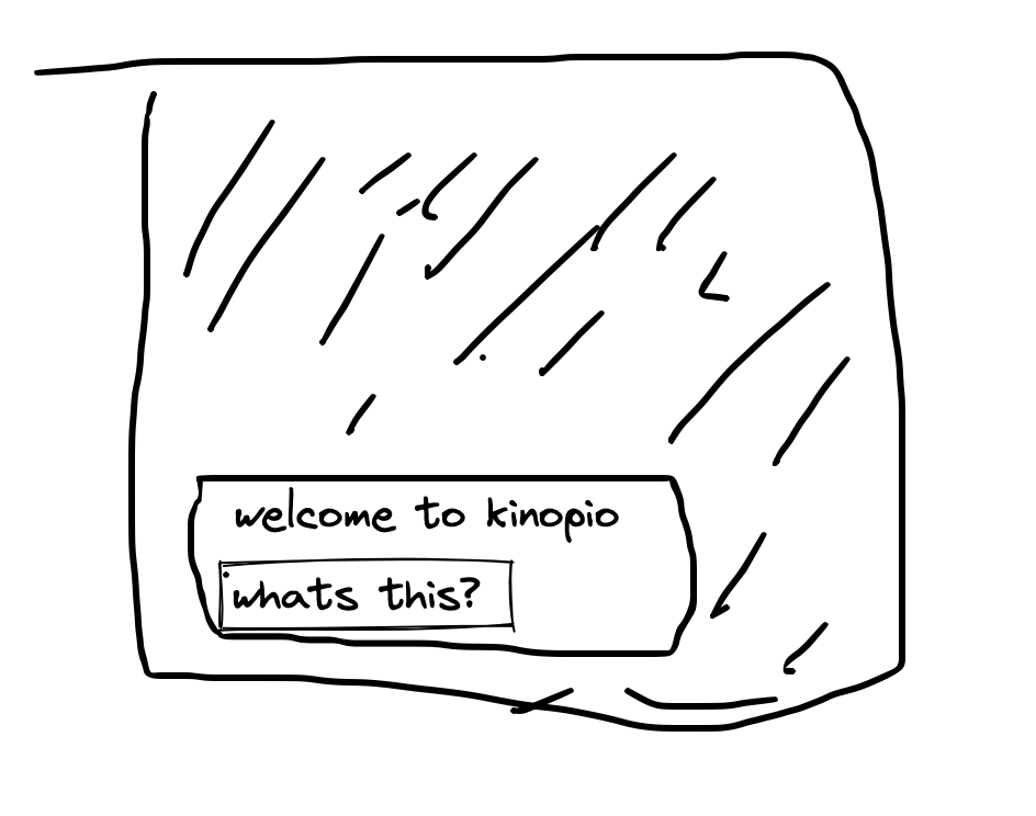
prominent notification appears on teh bottom of the screen, click the ‘what’s this’ to be sent to a regular static marketing page. You can navigate back at any time.
of these three options, the last one is the easiest to implement and makes for the best experiment
2 Likes
do you think the current visual design of the help site would work for a marketing site too?
if not, what visual qualities is it missing? Too plain?
1 Like
I feel like it’s too plain and flat, given kinopio’s spirit. I would thing something less linear and more “spatial”. Maybe slightly rotated elements (homage to jiggle). Little streaks of color (like connections)?
2 Likes
If you do the third, I’d consider going pretty big, maybe 1/3 of the screen.
Imagining myself as a new user, I’d want a welcome message, a description, a main visual (maybe even a little video embed) and some fun kinopio styling // little visuals around it.
I say go big because I want to make sure there is at least enough information in it that someone could get started if they don’t want to click deeper into a marketing page with features, info, etc. and to make sure the user has to confront it, at least a little bit, so the message gets across that there are resources to help.
If it’s too small it’s easy to ignore, X out, and forget it was ever there.
2 Likes
I like the idea of a video in the embed, enticing with the idea of more walkthroughs/explanations - or even just animation being like ‘hey look at me’. The big advantage of video/animation is that because it’s moving, it doesn’t need huge size to be attention grabbing
1 Like