Experimenting with moving the space background button from the footer to the space details dialog
goals
- encourage more ppl to try different space backgrounds
- background setting feels more contextually placed (because it’s next to other background metadata editing)
- simplify the footer (reduce upfront cognitive load)
1 Like
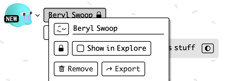
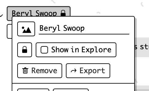
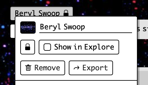
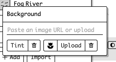
Here’s what it could look like,
I tried using the flower icon, and a couple other things, but maybe just a thumbnail of the current background would be clearer (with a simplified representation of the default background)
1 Like
some alternative icons i made/tried:
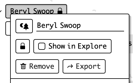
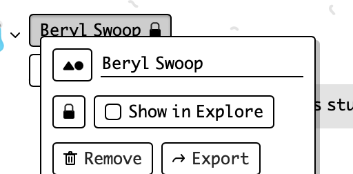
of these I like the first one (landcape mountains one), but it still all felt like it makes the dialog look more complicated/busy
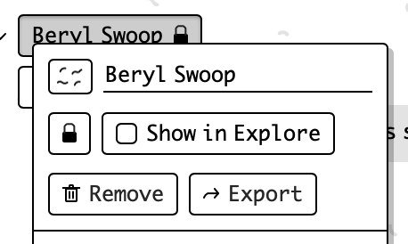
cleaned up the geometry on the squiggles. In the context of a button icon, the squiggles look off if they’re as organically curved as the real background
or, w 4 lines, something like
2 Likes
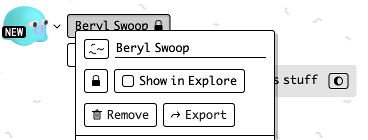
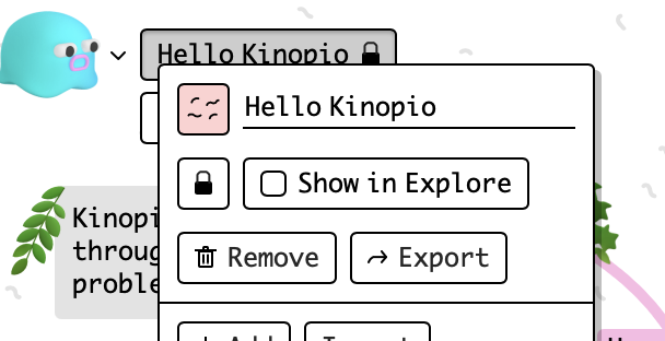
and with a background active:
1 Like
working in my prototype, removing the high contrast background button from the footer does make it that tiny bit easier to focus on making cards etc
1 Like
as part of this release i might also update the background images to make it more of a bigger deal,
any background recommendations? (general themes, or specific images)
also going to add the new ability to select a tint color, which’ll overlay over the background image.
This should help address those who want a large variety of conservative backgrounds (usually for work purposes), and a also serve a request I got for adjusting background image opacity
1 Like
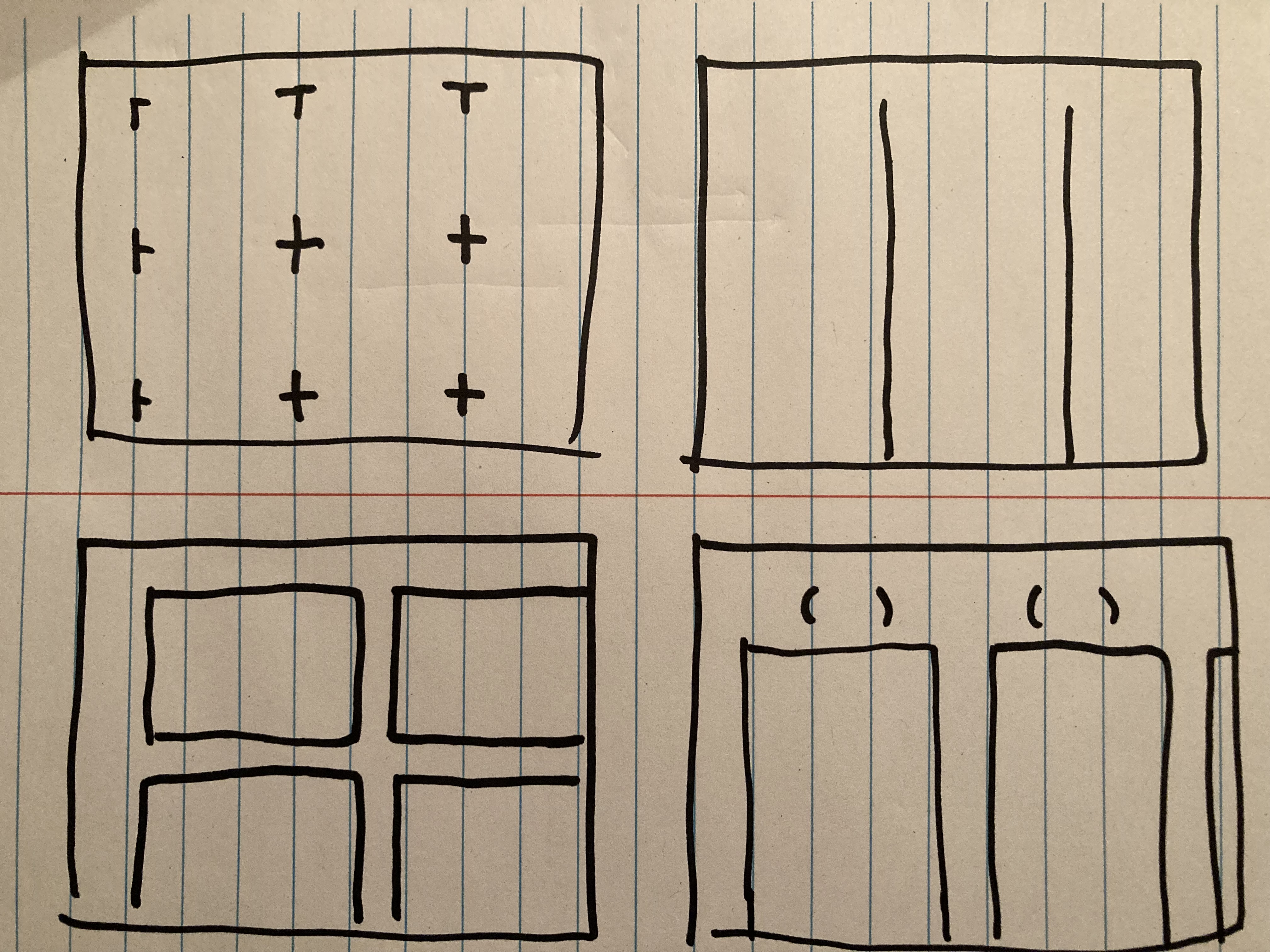
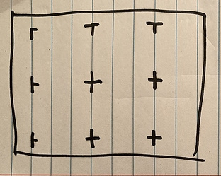
I would dig some more functional backgrounds, by which I mean large grids, boxes, areas that serve as guidelines for folks to group cards.
got any examples i could reference?
Although I’m not 100% sure that boxes, arrows etc. is the best fit for backgrounds to do,
grids make sense, maybe I can make some by recreating some paper journals
I’ve been thinking of deprecating the animated backgrounds list, haven’t really seen anyone using it irl. Thoughts?
I think there are rare occasions I would use this, more as a gimmick. So I would not be against removing it, but I’d want to keep a pointer to some that you’ve curated for those occasions.
On a slightly related note, I often want to add a sticker image, but not an animated one. Sometimes the animation is too distracting.
Yeah, grid paper and other marks on paper journals are an excellent example of what I’m thinking.
So different kinds of grids. Demarcating rectangular regions, columns, blocks. The 4th pic has a mark on top where you can put a single card to name the section. Stuff like that 
1 Like
Yes! To me, Kinopio is simplicity, so I am a big fan of removing buttons or putting them somewhere inconspicuous
Do it
Firstly, I really like the squiggles background. It’s somehow neutral yet interesting and full of character.
You’ve probably seen Subtle Patterns but that would be my go-to if I wanted to use another background on Kinopio.
1 Like
I want to make some grid-ish backgrounds that have these characteristics. That’s been my issue with the subtlepatterns stuff, it is subtle but it’s also v not usually visually interesting
1 Like
fully agree, maybe you could make something in your style that resembles this idea from ben?
2 Likes
Just released the first of three updates
-
 backgrounds now lives in spacedetails and has an updated layout (the option for animated backgrounds still exists, it lives at the bottom of the list)
- tint any background with a color
- new backgrounds, including some paper notebook style grids and other practical options
2 Likes
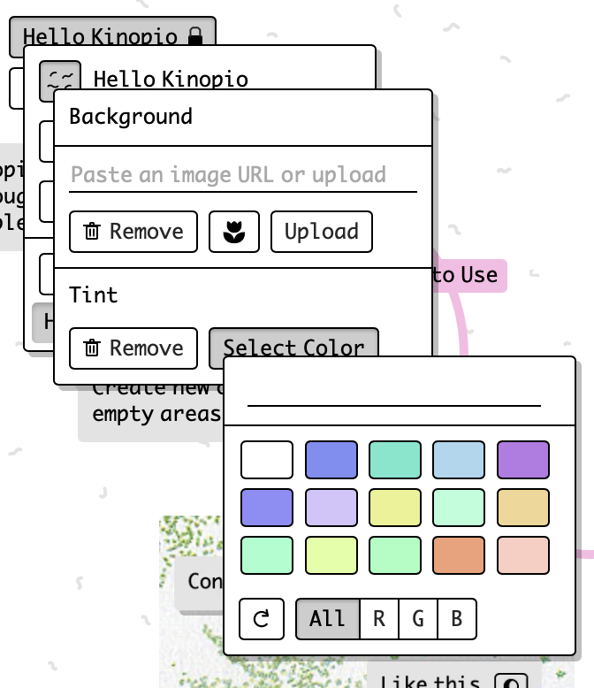
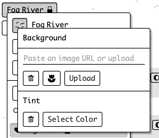
tried a couple different interfaces for specifying a tint color:
-
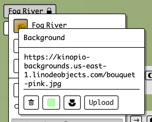
nicely streamlined, but having only one remove button (that removes both tint and background, feels like a limitation irl and leads to mistakenly removing both image and tint when you meant to only remove one of those)
-
full control and compact, but a bit hard to grok initially. Feels more complicated than it actually is
-
The most straightforward, but least space-efficient , and maybe most noisy
there might be a 4th option, but nothing’s coming to mind right now, will sleep on that
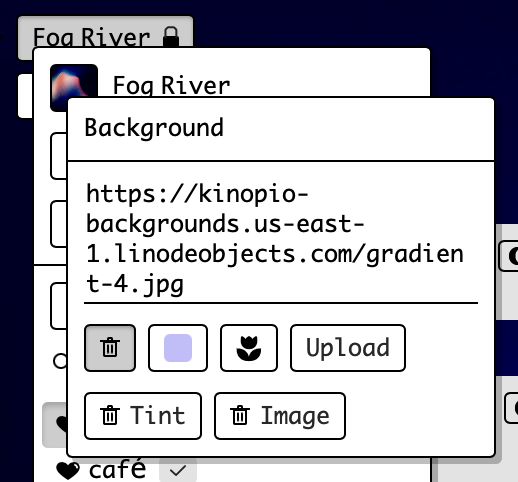
think i’ve got a 4th way,
if both tint and a background image are active, then clicking remove gives you individual remove options
I can’t tell – if you specify tint (but no background image), do you still get the default squiggles?
Ya it’ll tint the squiggles
1 Like