hi, so i had certain suggestions regarding the overall UI of a space:
1. Non-Card UI
First of all, the UI controls and menus that are spread across all the four sides of the canvas, I don’t think they should be in a card format because the “card format” also happens to be the way users actually input data and interact with Kinopio. I’m not a UI/UX expert but I feel the controls of an app shouldn’t really get camouflaged with the contents of that app, especially in case of note taking/ tools for thought apps where having a clean and clear starting page is the key.
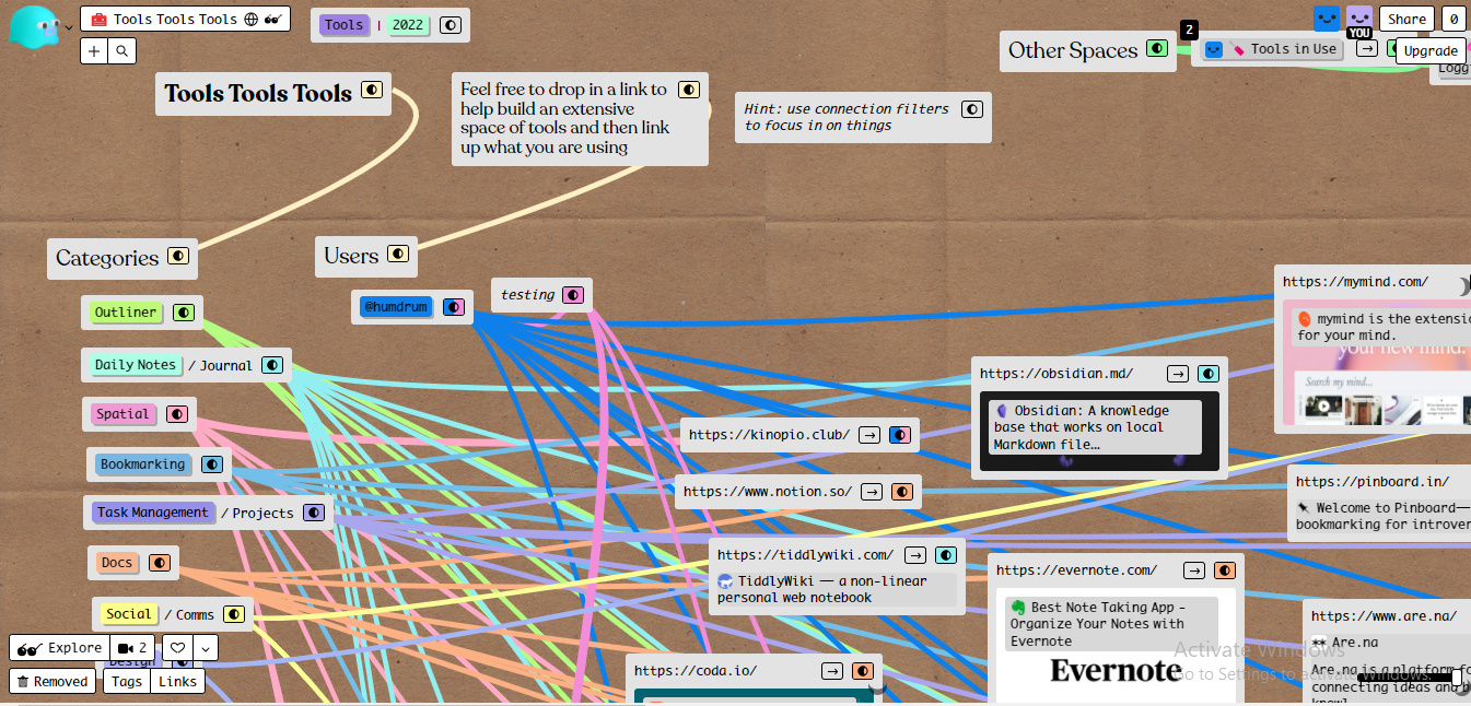
Also, worth noting is that these card style controls and menus are not concentrated at one corner but distributed on all four corners of the screen.
So basically, having card styled controls (on a card based canvas/space) makes it kind of hard to distinguish what’s what at first glance. I’m attaching a screenshot below for reference, and you can see that the controls and the menu have gotten lost in the content of the page itself with no means of visual differentiation.
Solution: the only solution as a user I can see now is moving most of the controls floating aross the four corners and arranging them neatly in a sidebar on the left (not every single control/menu obviously but those which can be glued together), while also giving the ability to collapse the sidebar in case someone wants to focus fully on the thinking sans distractions.
- View Mode while sharing spaces online
This is a small tweak that can be made for read-only spaces, if any case the above changes do not make sense to the creator (because of personal design choices + I understand moving everything to a sidebar is probably a lot of work) I have another small request, wherein when a person shares his space as a link for people to read, atleast in those cases the controls can be hidden for the viewer.
Reason being, many times we might share something like a personal profile (linktree alternative), a reading list, some meeting notes etc, and so essentially to the person looking it on the web, it would make much more sense if it looked purely like a website without the menus all around. Or maybe there could be an on and off “view mode” switch where the menus and controls dissappear when toggled on.
- A Future Use Case of the Sidebar
So as to not stretch this post any longer I’ll tell long story short.
I believe that the workflow of most people contains 3 major steps:
-
Dump/Inbox: dumping fleeting notes, links, bookmarks, files, tasks, feelings into an inbox
-
Zettelkasten: categorising all the clutter dumped in the inbox into broad folders such as journal, tasks, knowledge base etc
-
Connection: once similar notes and contents are present in a folder, they can be distilled, reviewd, edited and mostly importantly connected to each other in the form of backlinks and tags
Now, as of now, Kinopio as a tool is exceptionally good for the first step, as you can instantly dump whatever is on your mind and instantly free your mind.
But when it comes to the second step I feel it lags a bit because (as of now) there is no way to bunch together cards into a catlog, group, folder etc.
So, how a sidebar would really help with this is that once we’ve dumped everything on our mind in an inbox space, when we come back to review the space, it would be very helpful if we could just drag and drop cards/group of cards into different spaces by dragging them to the sidebar (assuming, that a user’s spaces would also shift to sidebar just like notion in case a sidebar thing happens)
These were not really feature requests per se, more like rough futuristic concepts of how Kinopio could shape out to be in the future, but since the dev is so responsive in hearing and implementing feedback i just thought of putting it out here