I feel like the tags list/dialog is a bit narrow since it needs to show space name along with the rest of the card.
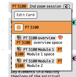
The tag badge also gets broken up, which doesn’t look great. Here’s what it looks like without any widths specified:
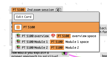
I feel like the tags list/dialog is a bit narrow since it needs to show space name along with the rest of the card.
The tag badge also gets broken up, which doesn’t look great. Here’s what it looks like without any widths specified:
just released an update that removes the 200px constraint for ‘narrow’ dialogs, now the max width is 250px. Let me know how that feels and I can adjust if necessary