I am very happy that we got colored cards :). But I see that we now have a weird inconsistency in the formatting pop-up menu when both connections and cards are selected - se the colored square.
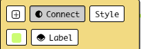
Shouldn`t there be some consistency? Like one row for formatting connections and one for formatting cards?
1 Like
The second row is for connection editing, but maybe there’s some way to clarify the color button is for connections here
2 Likes
releasing soon, using an ‘curved-path’ icon to differentiate connection type color selection from normal color pickers (eg card color)


3 Likes
Sounds reasonable to me. I am just asking myself why not to have the color of card also on this pop-up? I don’t know your plans. Maybe you need place for arrows and advanced styling of lines.
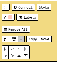
I think that one could possibly move “connect” to the row with “remove” and then put formatting for cards on the same level as for lines to have it consistence. But it is just brainstorming, nothing more.
2 Likes