Minor thing: when using dark background images the little moons that point to other parts of the canvas that have content blend in, screenshot attached.

2 Likes
Thx for the report , I’ll have to look into whether there’s a lightweight way to determine if an image is ‘dark’
2 Likes
Ty! Would a colour selector make it easier / more fun? Could set them to your own preference based on the background you choose that way. Or just hot pink. Forever hot pink. That or just invert whatever is under them.
2 Likes
A color selector would certainly be an easier way for me to solve the problem , but it also seems like having to set moon colors for each space would be kind of fiddly?
The distinction for me between card colors is that that’s content that you made so makes sense to personalize. But the moons are user interface
2 Likes
I wonder, like if a user is already in there setting a new background, they are kind of in “fiddle around with things” mode already past the board defaults.
The option is there in the background to set the accent colour, wonder if the moons adopting that colour choice would work? That way it won’t introduce additional UI (unless you had an example moon in that window to make it clear the cause and effect) but will cover off the edge case with dark-on-dark moons.
2 Likes
Maybe it’s just me but background feels like user content still and the moons don’t. Also there’s the issue that if you make a new space you won’t see any moons and so you won’t really be able to see the effects of your change until some time later.
This is one of those cases where the more dev work approach of autodetecting maybe justified because it makes this control something you don’t have to think about
3 Likes
Thank you for playing back your approach to reasoning with features, its good insight =)
The visibility of the effect on the moons is interesting as I totally missed them for the first few days of use. I really like the clear conceptualisation of UI vs Content here as well!
Would a straight inversion of colours under the icon work for the aesthetic of Kinopio then?
2 Likes
That would be cool, but would fundamentally require detecting whether the image is dark ![]()
1 Like
Yeah forgive me on that one, I was primarily a backend engineer and was doing the “surely there’s a magic-css-thing that allows a graphical object to invert the thing under it”, aka, I know very little about the domain lol
2 Likes
https://stackoverflow.com/questions/50986688/invert-text-color-based-on-background-in-css perhaps something like this would work…
2 Likes
Oh great idea if it works it’ll be a pretty ideal solution. Will look into it
1 Like
Bumping cuz currently working on this
2 Likes
![]() dark content support released https://twitter.com/KinopioClub/status/1587127753895251973
dark content support released https://twitter.com/KinopioClub/status/1587127753895251973
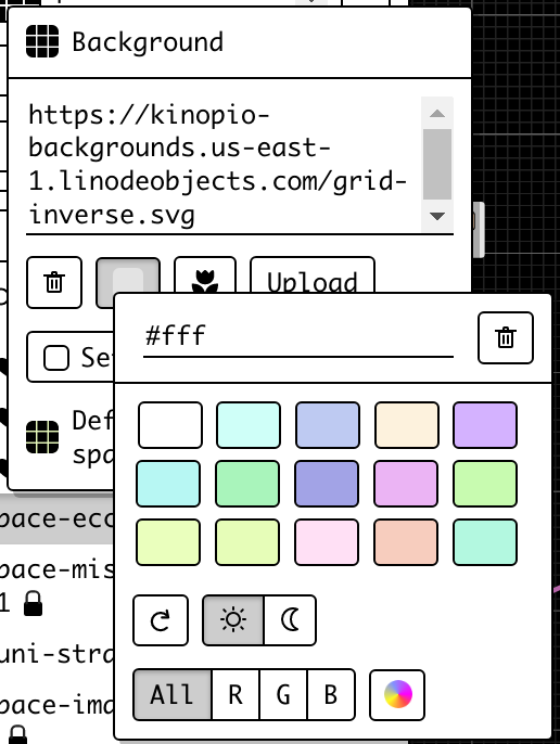
the way it works is some background images from the preset list are manually set to be dark. In addition to that if you set a dark background tint color on any background it’ll be treated as dark
1 Like