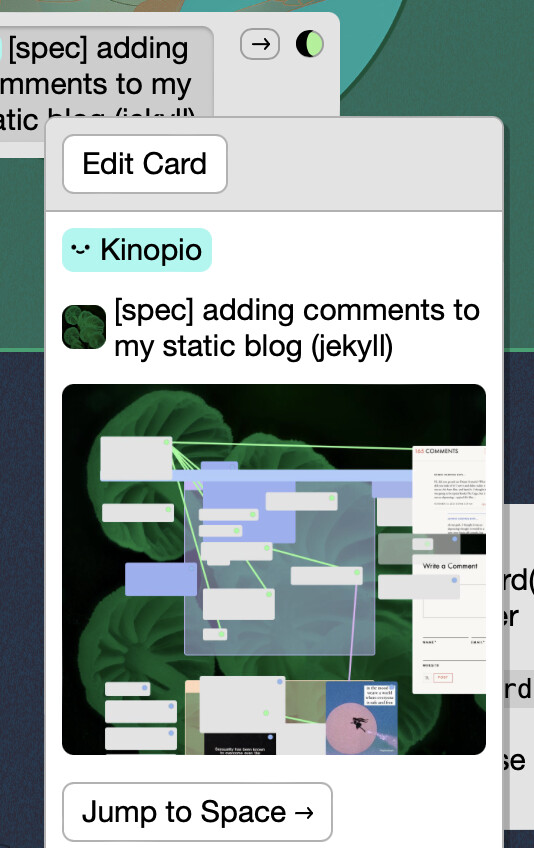
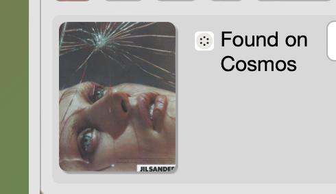
Second is from the Discord, “the ability to optionally show a rough screenshot of the the space in a card with a space link”
… I’d still want a back link, but my ugly hand-drawn diagram may not convey the best version of that… A ‘space link’ looks like I’m in a space containing that smaller space. I want a link that looks like I’m in a space within a larger space, that links me to that larger space. What could that look like? I have no idea
I’m a little skeptical of this one in isolation. I think the association with ‘backness’ is not an association that is commonly/generally shared. The way I’ve tried to present it as a link (albeit a special kind of one), and like any link on a website <a href="https://example.com">like this one</a> it’s content is considered before it’s spatial location.
I proposed showing the space screenshots on space link cards to kill two birds with one stone. Instead of a spatial-model-dependent ‘back’, I think showing a unique looking representation of the content will make space links more identifiable as space links.
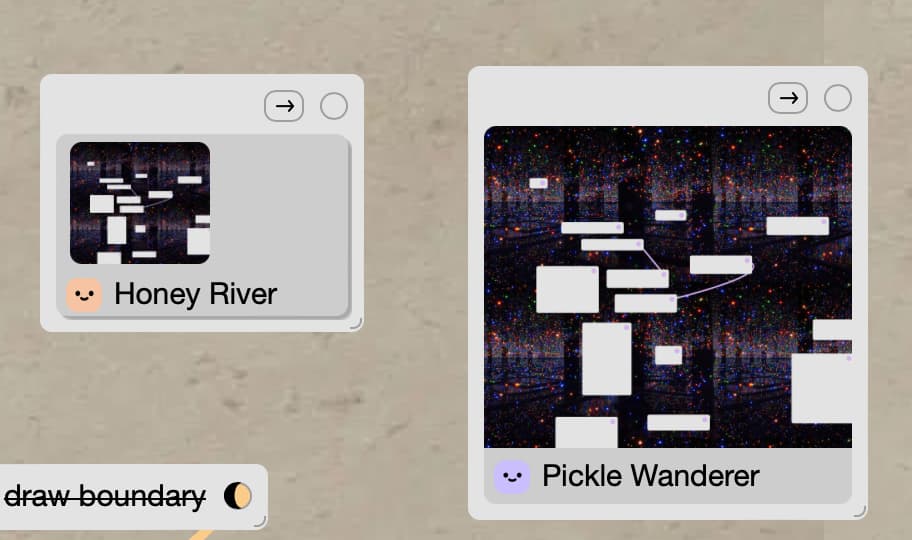
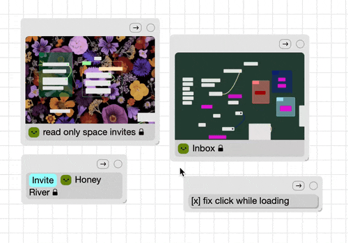
I would expect clicking on the left one to do what currently happens, do a sort of two-step thing where first it pops up a larger space preview… I don’t actually like that behaviour very much but it is what i expect
The right one would jump straight to the space, but it’s a bit odd to have two buttons that do the exact same thing, i.e. the image and the right arrow button, “[->]”
I would prefer the right, I’d enjoy being able to scale the preview to any size that suits me, and I’d like to click and go directly to the space
The one on the left, I would expect it to open a dialog that I guess would then let me navigate to the space. I think that’s because it has the affordance of a button.
The one on the right is ambiguous. My hope is that there would be the ability to directly navigate to the space, like clicking the right arrow button does.
ya for the right one (which I’m also leaning towards) will act like the url preview currently does. clicking it opens the normal carddetails view with info on the linked space at the bottom, as well as options to configure if the screenshot is visible in the card. This will replace the old dialog.
For one click navigation the arrow button will still do that.
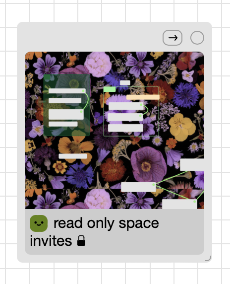
there are some implications of the new design that existing space link users should know about:
the height of cards with a space link is a little taller , so some tightly packed layouts are gonna need you to clean them up
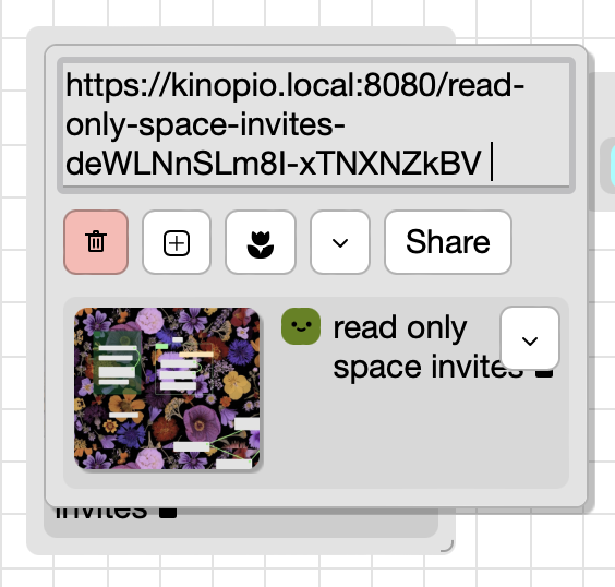
your existing space links won’t have images. You’ll need to click in and toggle ‘all’.
the linked space also needs to have a space preview image generated, which you can do by visiting the space at least once. Each time you visit the space the preview image will be updated regenerated.
because I have the preview img headers set to expire (max-age) in 5 minutes,. the same browser won’t show an updated space image for 5 minutes because it’ll be loading it from the cache.
the aspect ratio of preview imgs was slightly widened (i.e. the images are shorter), so existing space preview imgs will need to be regenerated to get the final ratio