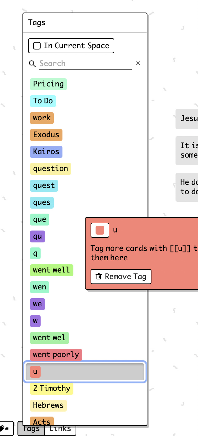
The dialog appears next to where I click
until I click on tags in the second lower half. here the position of the dialog doesn’t change:
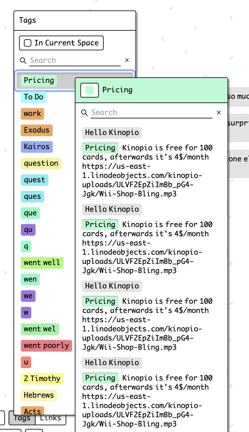
The dialog appears next to where I click
until I click on tags in the second lower half. here the position of the dialog doesn’t change:
yeah it’s a bit not perfect for sure,
the reason it goes up there is to ensure that the tag details dialog isn’t positioned too low on the page (which would make it either cut off or be too difficult to scroll). In the future i’ll look into fancier/dynamic positioning solutions to address this