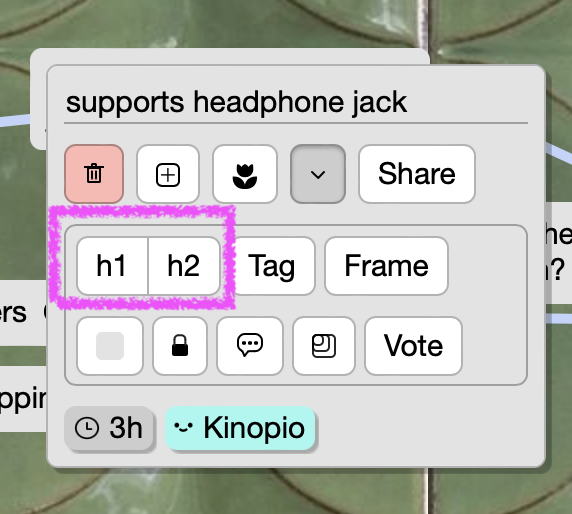
Context
When you open a card the first action button is a segmented h1/h2 button which updates the card name with #s to give it markdown header formatting.
I never liked how prominent these buttons are because:
- you can always type the
#s yourself to make an h1/h2, so there’s already an easy way to do this
- there are other ways to establish hierarchies using card position/colors/frames or boxes
- the prominence of it implies that it’s the recommended way to establish hierarchy, and I don’t think that it is
- in terms of getting the most out of kinopio and floating features you’d never think of, I’d argue that tags and frames are more useful
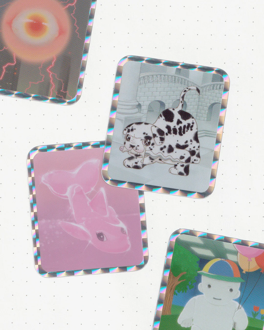
Combined with this, I’ve been thinking about how to add the ability to give cards a slight left or right tilt for a while now… I’d love to give ppl the expressive capability to do stuff like this:
The code part is easy, the ui part less so:
I tried having it so that dragging on the bottom-right left would interactively tilt the card, similar to how card resizing works now. But I found having two zones on a card, with similarly tiny visual affordances, that do two very different things to be a little awkward to learn and remember. It’s not a very ‘intuitive’ interaction. This approach is also difficult to use on mobile/touch.
proposal
What if the card h1/h2 buttons were replaced with tilt left/right buttons?
how important/used are the h1/h2 UI buttons in your workflow?
1 Like
just a reminder that this is a Proposal – not a plan. This is a very rough idea that may or may not be abandoned. We may also think up better alternatives for exposing tilt-ing functionality, or decide that tilt-ing isn’t something that should exist.
1 Like
I never use the H1/H2 buttons but that’s because I’m used to markdown and always type # when I need them, especially because I use h3 a lot.
I’d definitely be fine with this change and welcome it with open arms 
2 Likes
I love the markdown support and think freeing up the screen real estate is a great idea
2 Likes
I agree. Not important for me to have buttons to do that. I feel that those buttons are too prominent. I use them, but they feel “hollow” wrt to functionality of the overall kinopio way of doing stuff.
Having tilt where h1/h2 are right now also feels too prominent, though. Would make more sense after vote, scooting the checkbox and lock up to top row on right side…
Just curious, why slight tilt instead of full rotation?
2 Likes
that makes sense, might be a good opportunity to reorder things. The checkbox btn is already more prominent tho bc it’s above the whole toggle-able action area
why slight tilt instead of full rotation?
Full rotation control would probably have to be interactive and require dragging on the card in some way, which has the issue mentioned earlier:
I tried having it so that dragging on the bottom-right left would interactively tilt the card, similar to how card resizing works now. But I found having two zones on a card, with similarly tiny visual affordances, that do two very different things to be a little awkward to learn and remember. It’s not a very ‘intuitive’ interaction. This approach is also difficult to use on mobile/touch.
I also thought about a two finger gesture for mobile, but it’s harder to get right because web apps receive slower/less touch samples than a native app. And because in some case the gesture would interfere with the existing pinch to zoom.
1 Like
Tilt was implemented Feb 23, 2024. Tilt by dragging bottom-left corner.