Especially now, as Kinopio gets more and more features, I feel that its UI/UX is a little bit inconsistent. There are different places that can do something similar but not the same thing, scattered across the screen. I have addressed the search card and card text editor elsewhere. I think, one could perhaps improve also the search and unite it somehow.
Currently, there are following, separate places for searching:
- Spaces (left sidebar)
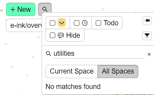
- Cards (left top, next to +new)
- Tags (right sidebar)
Why so many? Sometimes I am maybe not completely sure whether something is a card or a space, or maybe even a tag.
This is for discussion but I see that other apps often try to combine both. E.g., in UpNote, when I search, I get folders and notes. In SiYuan, I get pages and blocks, etc.
Just brainstorming.