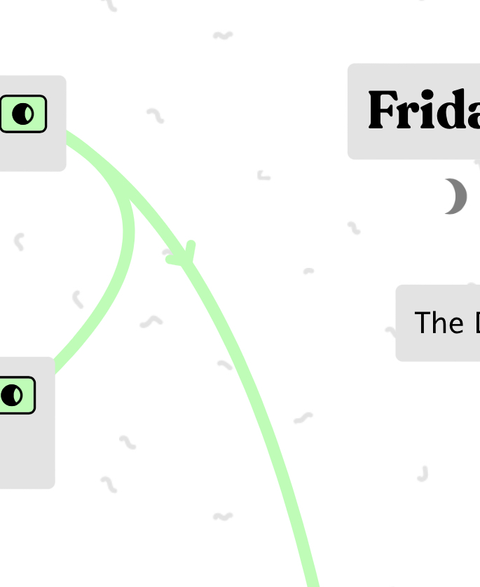
I was wondering if there’s a feature or plans to develop an indicator of which way a connection is being made between two cards? Something like an arrow, perhaps?
I love the labeling feature, and I’d like to be able to define relationships like “is a part of”, “can produce”, etc. The problem is if there’s no indicator, you can’t tell if card A “is a part of” card B, or the other way around.
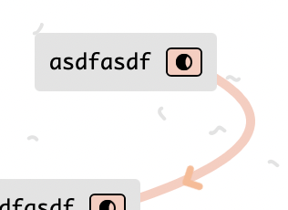
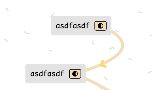
in a specific color contrast case like that it might make more sense to change the color of the connection type (which you can already do), rather than setting the display properties of an individual arrow
For me, it’s not about the contrast. As much as I like the subtlety aesthetically, I don’t think it’s obvious the image is an arrowhead that is indicating the direction of the connection.
For example, I created a diagram with some arrowed connections to share with coworkers and struggled whether to keep them or hide them because I didn’t know whether they would be more confusing than helpful.
Some ideas:
Animate or expand the arrowhead upon hover
Make the arrow a different color (based on connection color)
Move arrowhead closer to destination, or have multiple ones